Messages Report
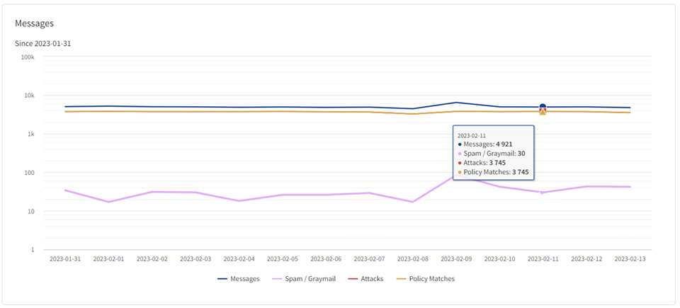
The Messages report shows you:
- How many messages were received by Cloud Email Protection
- How many of those messages were
- Spam or graymail
- Identified as any type of attacks
- Attacks matched by any policy
The chart is in a line chart format. Hover over any point on a line, representing a single time period (day or week), to see the data for that time period.
When you view either 7 days or 2 weeks of data, each point represents 1 day. When you review 1 month of data, each point represents 1 week of data.
The items in the legend are also toggles. You can click on an item in the legend to include or exclude it from the report.

TIP: Unlike other reports, the Y axis in this chart is logarithmic.
If you're polices are well-tuned to match the attacks you receive (see Policies), the Attacks and Policy Matches lines should be very close or even overlap. (In this example they do overlap, meaning that at least one policy matches every attack received, which is why you see only 3 visible lines.)